Tie-dye has come a long way from its summer-camp origins. In 2026, it’s not just a DIY weekend project, it’s a legitimate fashion statement that’s showing up in streetwear collections, high-end designer runways, custom apparel brands, and sustainable fashion lines. Whether you’re a clothing brand looking to launch a tie-dye private label apparel collection, a bulk apparel buyer sourcing for retail, or simply someone who wants to create pieces that stand out, understanding which tie dye colors combinations work and why they work is half the battle.
This guide covers everything: from timeless, tried-and-true color pairings to the fresh, trend-forward palettes making waves in 2026, with tips for different types of fabric, production scales, and end-use occasions along the way. No gatekeeping, just good color guidance.
Why Tie-Dye Color Combinations Matter More Than You Think
Half the magic of tie-dye is in the fold, the twist, and the tie. But the other half? Entirely in the colors you choose. A bad color combination doesn’t just look dull, it can turn into a muddy, unreadable mess. A great one can make even a simple crumple fold look like wearable art.
Good color combinations for tie dye aren’t entirely accidental. There’s real color theory behind what makes certain pairings pop, and understanding it helps you replicate results consistently, which is especially important if you’re producing tie-dye apparel at scale.
At its core, tie-dye color theory works around three types of pairings:
- On the colour wheel, complementary colours are those that sit opposite one another, such as red and green or blue and orange. These produce striking visual tension and stark contrast.
- Colours that are adjacent to one another on the colour wheel, such as blue, teal, and green, are called analogous colours. These naturally blend into one another to produce gentle, harmonious gradients, the ombre effect that’s so popular right now.
- Triadic colours, such as red, yellow, and blue, are three hues that are equally spaced along the colour wheel. They are balanced, vibrant, and nearly always appear deliberate.
When dyes blend at the edges of a tie-dye pattern, they create entirely new colors, this is where unexpected magic (and potential muddy disasters) can happen. Red and blue touching will create purple. Yellow and blue will bleed into green. Knowing this is essential before you apply a single drop.
The Best Classic Tie-Dye Color Combinations That Never Go Out of Style
Some combinations have been on shirts since the Grateful Dead era and they’re still flying off racks in 2026. Here’s why they hold up.
1. Red, Yellow, and Blue, The Primary Power Trio

Red, blue, and yellow are classics for a reason: they’re high-energy, deeply contrasting, and unmistakably retro. These are the original tie dye color combinations, the ones that come to mind the moment someone hears the word “tie-dye.” When swirled together in a spiral pattern, the overlapping sections create secondary colors (orange, purple, green), essentially producing a full spectrum from just three dyes. This is also one of the most forgiving combinations for beginner dyers since the contrast is strong enough to stay legible even with imperfect technique.
For tie dye shirt color combinations intended to evoke nostalgia, festival fashion, or a bold retro aesthetic, red-yellow-blue remains the gold standard.
2. The Rainbow, The Timeless Original
The rainbow combination, red, orange, yellow, green, blue, indigo, violet, is the most iconic of all good tie dye color combinations. Nothing says “tie-dye” louder. When applied with rubber bands in sections, it creates clean striped bands. When twisted and spiraled, the colors melt into each other for that classic festival-shirt look. Each piece is inherently unique, which is part of its enduring appeal.
As a business, rainbow tie-dye has the broadest demographic appeal and consistently ranks among the best-selling tie-dye styles year after year. It works on t-shirts, hoodies, bucket hats, sweatshirts, practically anything.
3. Purple, Pink, and Blue, The Psychedelic Trio
There’s something genuinely euphoric about this combination. Purple, pink, and blue side by side transport you straight to a 1960s summer festival, yet they somehow remain completely fresh in 2026. Use shades like neon pink, electric blue, and deep plum for maximum impact, or dial it back with magenta, periwinkle, and lavender for a softer, more wearable interpretation.
This is one of the best color combinations for tie dye on hoodies and sweatshirts, the slightly heavier fabric and larger surface area let the colors fully breathe. Accessorize with minimal pieces to let the shirt do the talking.
4. Blue and White, The Universal Crowd-Pleaser
The most popular tie-dye colour combination is generally agreed to be blue and white. It transcends cultural backgrounds, age groups, and fashion preferences. It’s serene, tidy, and elegant without sacrificing the handmade essence of tie-dye, with light powder blue fading into navy or cobalt exploding outward from a white center.
Blue-and-white tie-dye performs consistently across all demographics in terms of sales. It reads as sophisticated rather than costumey, is unisex, and goes well with almost every other item in a wardrobe. When adding tie-dye to a collection, this is frequently the safest option for private label and custom clothing brands.
5. Earth Tones, Brown, Green, and Orange

Although they may not be the most striking combination, brown, forest green, olive, rust, and tangerine are incredibly fulfilling. Earth tones in tie-dye have a grounded, natural, and deliberate appearance, more akin to what you would find at an artisan market than a fast-fashion store. The boho-chic, cottagecore, and nature-inspired styles that have persisted in women’s and unisex casualwear are well suited to this colour scheme.
Earth-tone tie-dye is a great option for fall collections and autumn-season product lines. Additionally, the colours look great with organic cotton, hemp, and linen, among other natural textiles.
The Tie-Dye Best Color Combinations for 2026
The broader fashion landscape has shifted since the pandemic-era tie-dye explosion, and the color combinations that sell best in 2026 reflect that shift. The era of loud, anything-goes rainbow spirals as everyday staples has given way to something more intentional, but tie-dye itself hasn’t gone anywhere. In fact, it’s evolving into something more sophisticated, more sustainable, and more versatile than ever.
Here are the color combinations tie dye leading the charge right now.
1. Cosmic Blues and Purples — The Galaxy Palette
In 2026, tie-dye will be characterised by deep indigo, violet, navy, and hints of white or silver. This colour scheme, which was inspired by the night sky and galaxy ice-dye art, gives apparel an enigmatic, celestial glow that looks particularly good on sweatpants, hoodies and dungarees. This combination enters the realm of streetwear when combined with metallic accessories or white trainers.
Its depth is what makes it so captivating. In contrast to flat primary colour schemes, the galaxy palette has depth; it is more like looking into something than merely observing it. A strong performer for brands operating in the digital-first commerce space, the subtle touches of white or silver mimic stars breaking through the darkness. This visual effect takes stunning pictures for social media.
2. Sunset Burst — Crimson, Coral, Peach, and Golden Yellow
Warm, optimistic, and undeniably striking, the Sunset Burst palette is one of the most commercially successful color combinations for tie dye shirts and tanks in 2026. This colour scheme, which combines crimson, coral, peach, and golden yellow, exudes warmth and optimism and is ideal for summer attire, particularly tanks, t-shirts, and crop tops.
This has strong seasonal appeal in spring and summer and is a fantastic choice for casualwear collections aimed at the 18–35 age group. Warm colours naturally blend together, so even if your dyeing method isn’t laboratory-perfect, the colours will blend into one another in ways that appear deliberate and lovely.
3. Earthy Neutrals — Olive, Sand, Clay, and Ivory
In the current fashion cycle, earthy hues, such as ivory, clay brown, sand beige, and olive green—are making a huge comeback. These subdued, natural-inspired colours provide a minimalist, grounded, fashionable, and eco-friendly take on tie-dye.
Brands that prioritise sustainable or conscious fashion, where the visual aesthetic must align with the brand values, are especially well-suited for this palette. It’s also one of the strongest color combinations for tie dye on natural and organic fabrics, the muted, nature-derived colors complement the texture and natural undertones of organic cotton, linen, and hemp better than neon brights or synthetic-looking pastels ever could.
For bulk apparel production and private label brands targeting the wellness, outdoor, or slow-fashion market segment, earthy neutral tie-dye offers a compelling differentiated product with broad year-round appeal.
4. Aqua Dream — Turquoise, Teal, and Mint Green
The Aqua Dream color scheme is refreshing, windy, and distinctly coastal, reflecting both ocean waves and tropical waters. This combination is ideal for casual streetwear on hoodies, shorts, and bucket hats that evoke the carefree spirit of summer or beach-inspired ensembles.
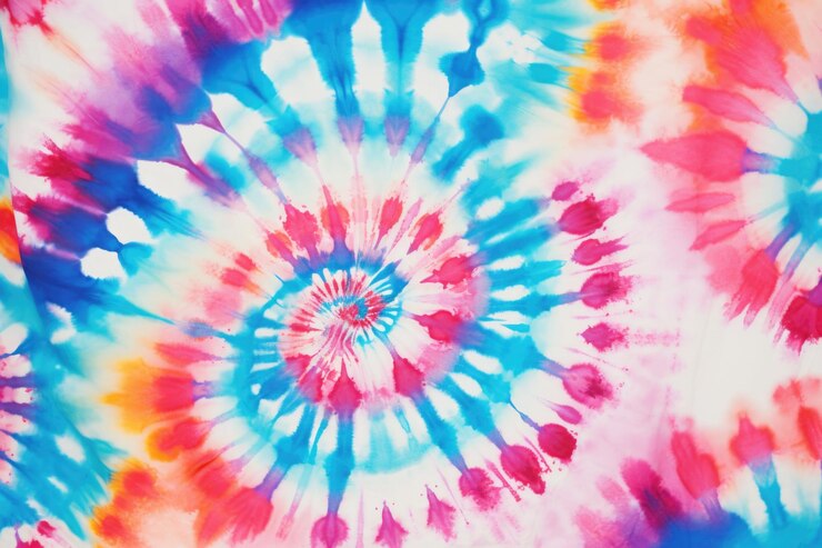
Teal and mint combinations have been popular in streetwear because they’re striking enough to stand out while avoiding the hyper-saturated, almost garish vibe of more traditional neon color schemes. The overlapping teal and mint, when combined with a spiral tie dye technique, produce a truly lovely effect with deeper blue-green tones in the center that fade outward into nearly white mint at the edges.
5. Candy Swirl — Pastels with a Modern Edge
Although the use of pastel pinks, baby blues, and soft lavender is not new, it feels new in 2026. This color scheme, which is perfect for children’s t-shirts, crop hoodies, and loungewear, has a nostalgic 90s feel with a contemporary twist. Pairing pastel tie-dye with clean, relaxed silhouettes, an oversized t-shirt, wide-leg joggers, or a boxy crewneck, rather than anything that comes across as overly cutesy, is the key to making it feel modern rather than dated for adult casual wear.
Because Candy Swirl color combinations have a soft, aspirational quality that works well on Instagram and TikTok, they are also very popular for custom-order and made-to-order businesses.
6. Monochromatic Blues — From Powder Blue to Navy
One of the more sophisticated color combinations for tie dye entering mainstream fashion in 2026 is the single-color family approach. Tonal gradients in earthy ochres, deep indigos, and monochromatic swirls on premium fabrics represent the direction high-fashion is taking tie-dye. For blue, this means everything from pale powder blue through sky blue, cobalt, and all the way to deep navy, all on the same garment.
This is an especially strong approach for brands positioning their tie-dye line above the mass-market tier. A monochromatic navy-to-powder crumple-dye t-shirt in heavyweight organic cotton reads as a premium product. It’s one of the best tie dye color combinations for menswear, professional-casual contexts, and anyone who loves the look of tie-dye but wants something more restrained in their everyday rotation.
Spiral Tie-Dye Color Combinations: Getting the Pattern Right

The spiral is the most iconic tie-dye pattern, and it also happens to be one where your color choice directly determines the outcome in ways that flat patterns don’t. Because the spiral creates a pinwheel of sections radiating from the center, the colors you place in adjacent sections will blend at every seam. This means your spiral tie dye color combinations need to account for what happens between the colors, not just what the colors look like on their own.
A few proven spiral combinations:
- Red, Yellow, and Orange: All warm, all complementary to each other. The blending between these colors creates richer amber and burnt-orange transitions without any muddy results. A high-energy spiral in these shades looks like a literal fireball.
- Blue, Purple, and Pink: Cool and warm meeting in the middle. The purple sits naturally between the blue and pink, so all three sections transition smoothly. This is one of the most elegant spiral cool tie dye color combinations and works beautifully on both light and dark base garments.
- Green, Teal, and Yellow: An underrated combination that produces incredibly vibrant, almost tropical spirals. The green-teal border creates a deep cyan, while the yellow-green edge glows almost neon. On a white background, this feels electric.
- Navy, White, and Cobalt: For a more refined spiral that doesn’t rely on high-contrast complementary colors. The white sections prevent the navy and cobalt from muddying together, creating clean delineation and a graphic, almost painterly feel.
One important rule with spiral tie dye color combinations: Avoid placing colors that will mix into brown or gray directly adjacent to each other. Red next to green, or purple directly touching yellow, will create murky transitions that undercut the entire design. Always think one step ahead about what your adjacent colors will produce when they bleed.
Tie-Dye Color Combinations for Specific Fabrics
This is a practical section that often gets skipped in tie-dye guides — but if you’re producing apparel at any scale, or working with premium materials, fabric choice significantly affects how your color combinations behave and look.
100% Cotton
100% Cotton is the gold standard for tie-dye. Fiber-reactive dyes bond with cotton at a molecular level, producing colors that are deeply saturated, long-lasting, and resistant to washing out. Cotton absorbs dye evenly, which means even complex multi-color combinations like full rainbows or detailed spirals will turn out clearly defined. Cotton is the best canvas for virtually any tie-dye color combination, bold or subtle.
Organic Cotton
Organic Cotton behaves identically to conventional cotton in terms of dye absorption, making it an excellent choice for brands wanting to combine vibrant tie-dye color combinations with a sustainability story. Fiber-reactive dyes are approved by Global Organic Textile Standards for use on organic cotton and other cellulose fibers like linen, jute, and ramie, making them the responsible choice for eco-conscious production. On organic cotton, earthy and muted palettes look particularly authentic, the slight irregularities in organic fiber create subtle variations in dye uptake that actually enhance the handmade aesthetic.
Linen and Hemp
Linen and Hemp absorb tie-dye beautifully and tend to produce softer, slightly more diffuse color edges than cotton. This makes them ideal for the washed, artisan-feeling palettes that are trending in 2026, earthy neutrals, muted blues and greens, terracotta and ivory. The slight texture of linen adds visual complexity that makes even simple two-color combinations feel premium. For sustainable fashion brands, linen and hemp tie-dye in muted color palettes is an incredibly compelling product.
Bamboo and Tencel
Bamboo and Tencel are increasingly popular in sustainable apparel, and they hold dye well, though they tend to produce slightly lighter results than cotton. Pastel and analogous color combinations work especially well on these fabrics, where the softness of the material complements the softness of the palette.
Blended Fabrics
Blended Fabrics (Cotton-Polyester) are where tie-dye gets tricky. The synthetic fibers don’t absorb fiber-reactive dyes well, which means the colors will look washed out compared to a pure cotton garment dyed with the same colors. For bulk production, stick to garments with at least 60% natural fiber content to ensure your color combinations translate as intended.
Tie-Dye Patterns and Color Combinations: Matching Technique to Palette
Different tying techniques interact with color combinations in different ways. Here’s a practical breakdown:
Spiral
As discussed above, adjacent colors in the spiral will blend. Choose harmonious or triadic combinations and avoid complementary opposites in directly adjacent sections unless you want a contrasting effect.
Crumple/Scrunch
This organic, random pattern is forgiving with almost any combination because the irregular folding creates unpredictable color placement. Earth tones, sunset palettes, and galaxy blues all look exceptional when scrunched.
Accordion Fold / Stripes
Perfect for two-color combinations where you want clean, dramatic contrast. Navy and white, red and black, or mustard and forest green all look incredibly sharp in stripe form.
Bullseye / Concentric Circles
Works best with analogous color families that transition from dark to light (or vice versa) from the center outward. Deep indigo to powder blue, or burgundy to peach, the bullseye technique essentially creates an automatic ombre effect.
Shibori / Itajime (Japanese Folding)
A more structured approach to tie-dye that creates geometric, repeating patterns. Single-color or two-tone combinations work best here, indigo and white is the most traditional and beautiful application. In 2026, shibori-style tie-dye on premium fabrics is one of the most compelling options for fashion-forward brands.
Ice Dye
A technique where ice is placed on a pre-folded, pre-soaked garment and dye is sprinkled on top. As the ice melts, it moves the dye in organic, unpredictable ways. This produces watercolor-like results that are unlike any other tie-dye technique. Galaxy blues, purples, and teals are the most popular ice dye color combinations because the organic spread of color mimics nebula and galaxy imagery incredibly well.
Tie-Dye for Streetwear and Fashion Brands: What’s Actually Selling in 2026
The streetwear space has embraced tie-dye in a more sophisticated way than the mass market. Major brands like Nike and Adidas have used tie-dye to make bold statements, and the patterns continue to appear in collections from luxury labels as well, cementing tie-dye’s credibility across fashion tiers. For streetwear specifically, the most popular tie dye color combinations in 2026 lean toward:
- Two-tone contrast combinations — Black base with acid yellow or electric blue overlay. Deep burgundy with off-white. These feel graphic and intentional rather than crafty.
- Tonal monochromatic palettes — All-black crumple dye, or a full navy-to-cobalt ombre. Black tie-dye has exploded in popularity in recent years because it translates naturally into streetwear aesthetics, doesn’t read as festival wear, and works across seasons.
- Muted earth tones — Terracotta, rust, olive, and warm beige combinations align with the broader streetwear shift toward earth tones and vintage-washed aesthetics.
- Galaxy / cosmic palettes — Indigo, violet, and cobalt on heavy-weight hoodies and sweatshirts continue to perform strongly in the streetwear-adjacent market, especially when the technique is ice dyeing or geode patterns rather than a standard spiral.
Oversized and relaxed fits dominate in 2026, prized for their comfort, unisex appeal, and effortless streetwear aesthetic, and tie-dyed prints are specifically recognized as trendy retro components that work well with these contemporary silhouettes. If you’re producing tie-dye for streetwear, the silhouette matters as much as the color combination.
Choosing Tie-Dye Color Combinations for Bulk Apparel Production
If you’re producing tie-dye at scale, whether for retail, custom merch, private label, or wholesale, there are some practical considerations that go beyond aesthetics.
Reproducibility
Reproducibility is the first challenge with bulk tie-dye. By nature, every piece is slightly different. This is a selling point from a marketing perspective (“every piece is unique”), but it creates challenges for quality control. The best way to manage this is to choose color combinations where the general palette reads consistently even if the exact pattern varies. Analogous color families (blue-teal-green, red-orange-yellow) are more forgiving in this regard than complex multi-color combinations where a slight variation in placement changes the overall look dramatically.
Dye Mixing
Dye mixing behavior matters enormously at scale. When you’re working with hundreds of units, you need to know exactly which of your colors will mix into beautiful transitions and which will produce muddy intermediates. Before finalizing your color combinations for a production run, always do a small-batch test on the exact fabric weight and fiber content you’ll be using.
Consumer Demographics
Consumer demographics and end use should drive color combination selection. For children’s clothing, bright primary combinations and candy pastel palettes consistently sell best. For college and young adult casualwear, bold contrasts and cosmic palettes perform strongly. For premium or sustainable fashion positioning, muted earth tones and sophisticated monochromatics in natural fabrics are the right direction. For festival and summer collections, warm sunset palettes and rainbow variations remain reliable sellers.
What sells best for custom clothing and private label brands specifically tends to be: classic rainbow spirals (always has a market), cosmic blue/purple combinations (currently trending, strong for hoodies and premium pieces), sunset burst palettes (strong for summer tees), and earth tones on organic cotton (growing, driven by the sustainability-conscious consumer). If you’re launching a private label tie-dye line, starting with two to three hero colorways rather than an unwieldy range of ten is the smarter approach, it creates stronger brand identity and simplifies production logistics.
Putting It All Together: A Quick-Reference Color Guide
Here’s a consolidated reference for some of the best color combinations for tie dye across different moods and use cases:
- Bold and Energetic: Red + Yellow + Blue | Full Rainbow | Red + Orange + Yellow (Fire)
- Cool and Calming: Blue + White | Navy + Cobalt + Powder Blue | Teal + Mint + White
- Dreamy and Feminine: Soft Pink + Lavender + Baby Blue | Peach + Coral + Soft Yellow | Mint + Blush + Lilac
- Earthy and Grounded: Olive + Sand + Clay | Rust + Forest Green + Ivory | Terracotta + Warm Brown + Mustard
- Cosmic and Dimensional: Deep Indigo + Violet + Navy + Silver | Cobalt + Purple + Black | Teal + Indigo + White
- Sophisticated and Modern: Navy + Off-White | Black + Electric Blue | Burgundy + Dusty Rose | Charcoal + Sage
- Tropical and Warm: Turquoise + Coral + Sunshine Yellow | Aqua + Tangerine + White | Lime + Deep Gold (currently trending in 2026)
Sustainable Tie-Dye: Colors That Work With Natural Dyes
An increasingly important segment of the tie-dye market in 2026 is natural and low-impact dyeing. There’s a growing preference among eco-conscious consumers for tie-dye created with plant-based dyes, including indigo, madder root, cochineal, turmeric, and avocado pits, which offer beautiful, often muted and earthy color palettes.
Natural dye tie-dye color combinations have their own logic. You’re working with what the plant world offers, which naturally skews toward earthy, muted, and organic tones. Turmeric produces rich golden yellow. Indigo produces deep, oceanic blue. Madder root produces warm reds and corals. Avocado pits create surprisingly lovely dusty pinks. Red cabbage, depending on pH, can yield purples and blues.
These aren’t as vibrant or as precisely controllable as synthetic fiber-reactive dyes, but that’s the point, the softness and slight unpredictability of natural dyes is part of their appeal. For brands positioning around sustainability, craftsmanship, and slow fashion, natural dye tie-dye in earthy and muted combinations is an authentic and compelling offering that commands premium pricing.
For brands using synthetic dyes but still wanting a sustainable story, fiber-reactive dyes that meet Oeko-Tex Standard 100 requirements are classified as low-impact, they cannot contain toxic substances and must have a high absorption rate to minimize rinse-water waste. These are a responsible and commercially practical middle ground.
Final Thoughts
Tie-dye in 2026 is about so much more than nostalgia. It’s a legitimate, versatile textile art form that spans everything from DIY home crafts to high-fashion runway pieces and bulk private-label apparel production. The tie dye color combination ideas that work best are always the ones chosen with intention, where you’ve thought about the fabric, the technique, the occasion, and the person wearing it.
Whether you gravitate toward the bold energy of classic primary spirals, the dreamy softness of candy pastel swirls, the earth-connected warmth of muted organic tones, or the cosmic depth of indigo-and-violet galaxy dye, there’s a palette here for every brand, every market, and every creative vision.
The beautiful thing about tie-dye is that even within a defined color combination, no two pieces are exactly the same. That’s not a limitation, it’s the whole point. In a world of mass production and identical products, Tack Apparel offers something genuinely irreplaceable: wearable art that belongs only to the person wearing it.